A series of self-initiated social media content design projects, each simulating a full Instagram visual identity for a different food and beverage brand. The projects demonstrate the ability to adapt design style, tone, and content strategy to suit distinct brand personalities and target audiences.
Skills: Social media content design · Brand visual identity · Content strategy · Grid composition · Typography · Canva
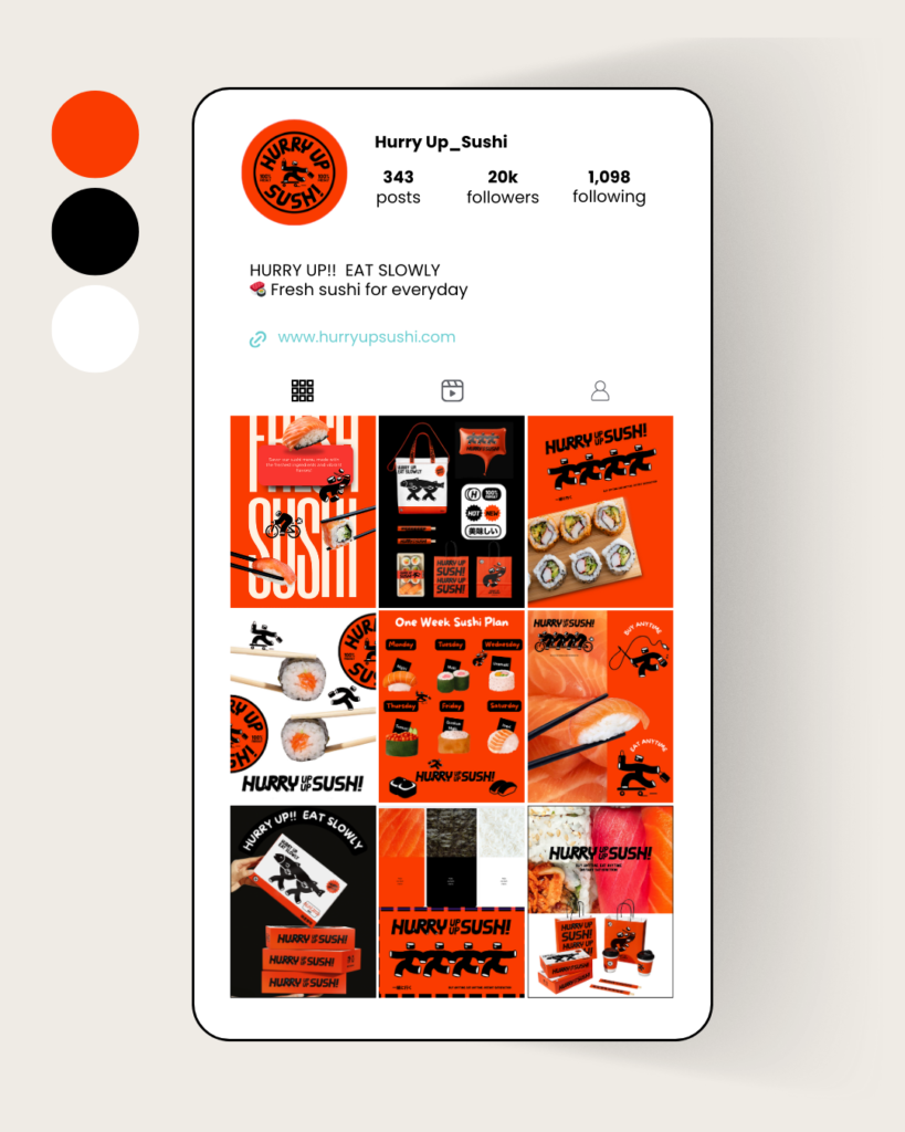
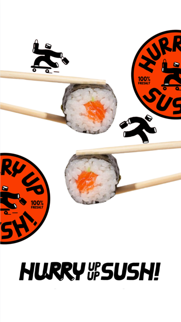
Hurry Up Sushi is a fast-casual sushi brand positioned around speed, freshness, and convenience. Targeting commuters and office workers who want a quality meal as quickly and effortlessly as grabbing a coffee. The tagline “Hurry Up!! Eat Slowly” captures the brand’s central tension: fast to buy, worth savouring.
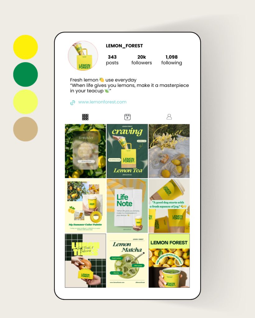
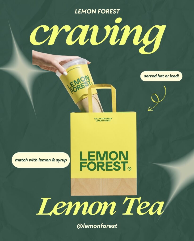
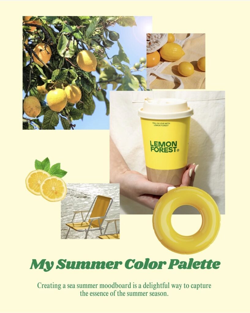
Lemon Forest is a lemon-forward tea brand built around farm-fresh ingredients, with a product range spanning classic lemon tea, lemon matcha, and seasonal specialty blends. The brand’s core identity — lemons sourced directly from their own farm, shaped every visual decision.
Hurry Up Sushi
Concept & Planning
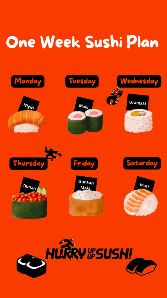
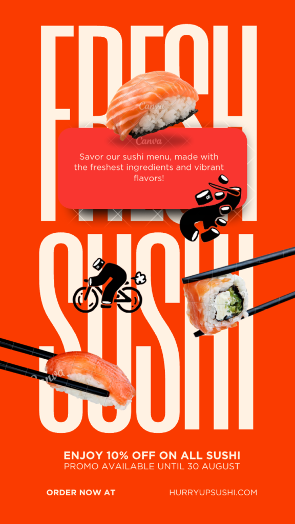
The brand’s personality called for a bold, high-energy visual identity. I built the content system around a striking red and black palette combined with a recurring ninja mascot — a visual metaphor for speed, precision, and Japanese culture. Post types were planned across product presentation, brand lifestyle content (weekly sushi plans, on-the-go messaging), and packaging visuals — all reinforcing the idea that fresh sushi can be as accessible and habitual as a daily coffee run.
Production
All posts were designed in Canva. Typography was intentionally large, bold, and graphic-forward to ensure strong visual impact on a busy social feed. The grid was composed to alternate between high-contrast type-led posts and food photography, creating a rhythm that feels dynamic without losing brand cohesion.
Lemon Forest
Concept & Planning
Working from the brand’s existing colour palette of vivid yellow, forest green, neon lime, and warm beige, I developed a content system designed to feel both energetic and cohesive. Posts were structured around three content pillars: product showcases, lifestyle and seasonal content, and brand storytelling around the farm-to-cup origin. This mix keeps the feed visually dynamic while reinforcing a consistent brand voice — fresh, playful, and quality-driven.
Production
All posts were designed in Canva with careful attention to typographic hierarchy, layout consistency, and colour application across different post formats. Each design was placed into a full Instagram grid mockup to evaluate the overall feed composition, ensuring the brand identity reads clearly at a glance and no adjacent posts clash in tone or layout.